Portfolio
Nour Case Study

What is nour?
Nour - a Harvard Business School start-up "creat[ing] skincare products to empower people of color to have healthy, beautiful skin." Today, there is a lack of sun care product options available for darker skin tones. A common pain point is "white cast"- when sunscreen leaves a white layer on the skin. To combat this, Nour is developing a tinted mineral-only sunscreen so that people of color can feel beautiful and protected.
scope
Constraints
Design Nour's pre-product website.
Expected deliverables:
-
High-fidelity mocks for web
-
Style guide
This was a 40-hour engagement. The team originally explored using Square Space but decided to migrate to Shopify. The designs provided would need to be easily implementable in Shopify and scale.
ROLE
Sole product designer amongst team of 4 with 2 in marketing and the founder, Mae Abdelrahman.
TOOLS
Figma, Shopify
The design process
TIMELINE
-
User Interviews
-
Mood Board/Branding
Expected deliverables w/ 40 hours
Scope creep
-
Secondary Research
-
Style Guide
-
Initial Mocks
-
Design
Iterations
-
Design
Implementation
In this case, because the team had already conducted user interviews and discussed the branding strategy, I dived into secondary research to understand the existing market before starting the designs.
COMPARATIVE Analysis
I researched comparative sites in the beauty care vertical to discuss how the team wanted to position Nour. Overall we looked at 4 competitive sites, Function of Beauty, EltaMD, Black Girl Sunscreen, and Glossier.
Function of Beauty
-
Feels playful. Immediately know the product offerings upon landing on the site.
-
The use of full imagery makes what's above the fold pop.
-
Copy is colloquial and user-centered.
-
Uses pastel gradients which make the site feel calming/youthful
-
Very minimalistic packaging

Figure 1. Function of beauty's landing page.
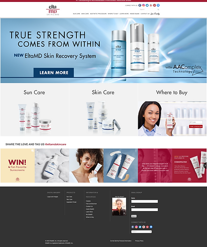
EltaMD


Figure 2. EltaMD's landing page.
-
Text-heavy packaging feels more clinical but knowledgeable (tried and true).
-
Minimal use of imagery and color makes the site feel more mature. Targeting females 30+.
Black Girl Sunscreen


Figure 4. Black Girl Suncreen's landing page.
-
The site feels more product-centric, with a slight infomercial feel to the design based on the chosen imagery.
-
Without additional white space, the text feels busy. Alignment issues make readability difficult.
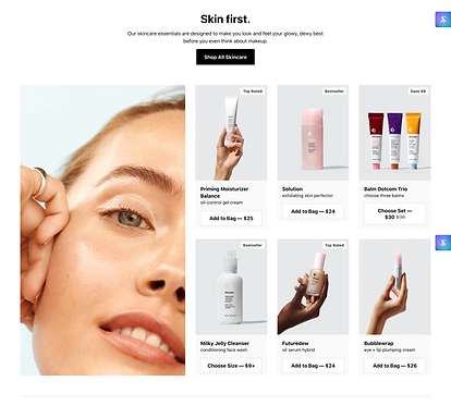
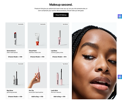
Glossier

-
A clear hierarchy of information that tells a story.
-
Consistency across the site makes the brand feel reliable/trustworthy.
-
Uses imagery with purposeful eye contact.
Figure 5. Glossier's landing page.


Branding
.png)
Nour's long-term vision is to build its product offerings and provide personalized formulas. After comparing different sites, Mae decided she wanted the brand to feel minimalistic, high-end, with a blend of earthy, muted tones and imagery of strong individuals of color to cater to her target market - females aged 25-50.


Figure 6. Nour's style guide and mood board to drive landing page design.
High fidelity mocks
We discussed the following points to incorporate in the initial mocks:
-
How might we educate users to understand why there is a need for sunscreen in the first place? Can we be educational but conversational?
-
How might we excite users to follow along in the journey? Can we optimize conversion to have a list of people to reach out to once the product is ready for testing?
-
How might we evoke a sense of community and have users rally around our goal? Can we direct users to the crowdfunding page to raise additional capital?
Design iterations
While the team was happy with the initial mocks and flow of information, we went back and forth mainly on imagery and copy. There were several iterations on just the tagline itself, evolving from "Skin care created with Black Women in mind" to "Skin care created for People of Color", to finally "Skin care made with melanin in mind". Inclusion, while celebrating diversity, was a main point of discussion and I'm glad there was consensus around finding the right balance of language.
Figure 8. Copy and imagery iterations.
WRAp Up
While this project concluded with the hand-off of the pre-product site, I hope to work with the team closer to a product launch to help with modifying the designs
This project allowed me to focus more on visual design. I prioritized high-fidelity designs over discovery/research and allocated time for scope creep. In the end, the team asked if I could set up the template in Shopify.
Digging into Shopify, I quickly realized how restrictive the templates could be. While I was able to implement minor code changes, mainly CSS updates, a few designs had to be made since I wasn't comfortable with liquid and changing the HTML. With that said, because the team's priority was to build their online social presence, I recommend leaving the site as-is for now until they were closer to defining a product launch schedule.
If I had more hours to allocate to this project, I would have to include product information and work on additional flows like the customer browsing and checkout experience.
TAKEAWAYS
-
Increasing sign-ups wasn't easy to measure as we saw other variables fluctuate, such as traffic to the site.
-
The design layout was heavily influenced by what I felt the team could implement in Shopify without a dev resource, but that task ultimately fell into my lap. Even as a designer, it certainly helps to have basic HTML/CSS knowledge, and I hope to deepen those skillsets.
-
With e-commerce, many design decisions are impacted by SEO, A/B testing, and ideally data-driven iterations. So while the team and I discussed different imagery and copy changes, I would want to test variations at scale in the future.


